
Behind Our Project
Photo of the Los Angeles skyline with the Santa Monica Mountain range behind. Image taken from Californiathroughmylense.com.
Selecting the Sources
To investigate how crime patterns across Los Angeles changed between 2021 and 2025, we relied primarily on publicly available datasets from municipal open data portals and law enforcement agencies, particularly the Crime Data from 2020 to Present dataset released by the Los Angeles Police Department (LAPD) through the City of Los Angeles Open Data Portal.
These datasets contain detailed records of reported incidents, including the offense type, date and time, geographic location, victim demographics (age, sex, race, ethnicity), and indicators of crime severity, including weapons involved. Because each incident is geocoded and tied to one of the city’s 21 LAPD patrol divisions, the dataset allows us to analyze both demographic patterns of victimization and the spatial distribution of crime across Los Angeles during the post-COVID period.
Using official datasets ensured that our analysis was based on consistently collected records of reported crime across L.A. This structure also enabled us to compare changes in various crime factors such as crime type, severity, victim demographic, and location between 2021 and 2025, simply following the COVID-19 pandemic.
At the same time, we felt it was vital to approach the dataset critically and consider potential gaps or biases. Not all crimes are reported, and differences in policing practices, reporting systems, community trust in law enforcement, or mere data collection methods can influence how crime appears in official records. Being conscious of these limitations allowed us to interpret our data more critically and gain a fuller picture of crime in Los Angeles. More information about the limitations of our data can be found on our Data Critique page.
In addition to the LAPD dataset, we consulted peer-reviewed research and credible policy and news sources on crime trends, policing practices, and structural inequality in urban environments, all factors that may influence crime rates. These sources were vital, as they contextualized the quantitative data and helped us understand the broader social dynamics affecting different areas/communities in Los Angeles. More information regarding our sources can be found on our Annotated Bibliography page.
Processing the Data
The LAPD crime dataset was generally well organized, though some minor cleaning was required before analysis. Using tools such as Excel and OpenRefine, we reviewed the data for duplicates, missing values, and inconsistent category labels. We also standardized variables such as crime types and date formats to ensure accurate analysis.
To create visualizations, we used tools including Tableau, R, and Python libraries such as Matplotlib and NumPy. Each team member chose to utilize different visualization tools based on their familiarity with the language and platform. Nonetheless, we all created our visualizations with careful attention to the type of data presented (qualitative or quantitative), the number of variables chosen to display, and how each graphic supported our overall narrative.
In addition to our visualizations, we used Timeline.js to present the importance of events and policy developments related to crime and Los Angeles’ political and social climate during the post-pandemic period. This interactive timeline provides greater historical context for the dataset by highlighting the social and policy changes that may have influenced the crime patterns depicted in our visualizations from 2021 to 2025.
Presenting Our Narrative
Our findings are presented on an interactive WordPress website to make the crime data accessible and easy to explore. The site uses a clean layout with clear navigation, including ‘Up Next” buttons at the bottom of each page, allowing users to move easily between sections that explain our research question, methods, and results.
Accessibility was also an important consideration in the design process. We wrote descriptive text for each visualization, chart, map, and image used so that screen readers could interpret the visual content. We also embedded hyperlinks within our narrative to make the site easier to navigate for assistive technologies. Finally, all section titles were formatted as proper HTML headers rather than just bold text, so screen readers can easily navigate the page structure.
We also used interactive visualizations that allowed viewers to explore crime patterns across neighborhoods, time periods, and offense categories. These visual tools help highlight trends that may not be immediately visible in raw data tables. Together, the narrative text and visualizations provide a comprehensive overview of crime patterns and the social context surrounding them.
The Team Behind the Data

Georgia Sherr
Project Manager
Hi there! I’m a third-year Statistics and Data Science major from Connecticut, and I was responsible for facilitating effective communication among team members, the professor, and our lovely TA, Kai! I coordinated our project milestones, maintained updated documentation, and, most simply, ensured our project was successfully completed for your learning.

Sarasi Rout
Data Visualization Specialist
Hi! I’m a second-year Statistics and Data Science major from Northern Virginia, and I was responsible for overseeing all of our data visualizations, ensuring each one was properly labeled, answered the research questions, and, most importantly, was easily interpretable.
Neva Williams
Data Specialist
Hi! I’m Neva, a fourth-year Statistics and Data Science major from Vermont. I was responsible for cleaning and structuring the dataset, conducting exploratory analysis, and designing clear visualizations. My goal was to translate complex findings into intuitive graphics that communicate insights accurately and to help understand and navigate the limitations of our dataset.

Joe Zhou
Editor
Hi! I’m a fourth-year Statistics and Data Science major from California, Irvine. In this project, I was responsible for data cleaning and creating the COVID-related visualizations to highlight patterns in the data. I also served as an editor, helping review the narrative for clarity, consistency, and accuracy.
Ziteng Cheng
Web Designer
Hi there! I’m a fourth-year Statistics major at UCLA. For this project, I served as the web designer, building and managing our HumSpace WordPress site. I also created a geospatial density map in Tableau to visualize crime concentration across Los Angeles and wrote a narrative analysis exploring how crime patterns shifted over time and space. Feel free to connect with me on LinkedIn!

Nathan Chan
Content Developer
Hi! I’m a third-Year Psychology major from Diamond Bar, California. I lead the development of the site’s main story, making sure the data visualizations and maps flow naturally with the written content. I also crafted clear section headers and engaging captions, sources, and added images to the site, and guided the creation of the “About” page!
Acknowledgements
The People Behind the Project
We’d like to take a moment to thank Kai Nham for his endless support and guidance on every aspect of creating this project. Thank you for always answering our questions with so much patience! Similarly, we’d like to thank Dr. Nicholas Sabo for sharing his passion and experience in digital humanities and for showing us just how deeply data and the world will always be intertwined.
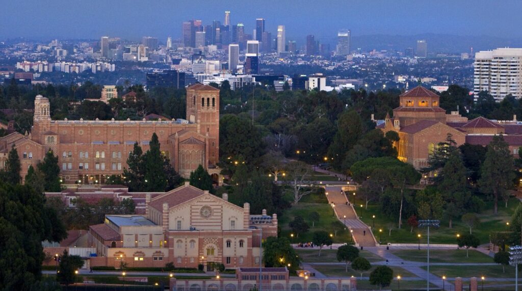
Photo of the University of California, Los Angeles Campus with the Westwood, Los Angeles skyline in the background. Images taken from UCLAbruins.com.